Striver - Find Your Perfect Race
Context
Running a full marathon is one of the most challenging and rewarding events that any of us will experience. 26.2 miles is a long way, but more and more people are taking on the challenge each year.
This project was inspired by one of my friends, Jay. He loves running and the great thing is he finally qualify the Boston Marathon last year. When I dug into the marathon world, I found that most of the runners seek for the records, including personal and age group. Qualifying for the Boston Marathon is a dream goal for many runners.
“I am always looking for a flat and downhill race course because the finish time is really important for me.”
Project Goals
There are plenty of tracking apps out there to help runners record their training log, such as Strava, Run Keeper, etc. However, there is no better solution to gather marathon information for runners and help them to find a race that fits their preferences. Thus, I would like to create a lightweight product that can help runners find their perfect race and share their experiences.
User Research
In order to identify the pain points in the user journey I have adopted the following techniques:
Conducted the user interviews to develop personas
experience mapping
User Persona
I reached out my running friends and interviewed with 10 runners from a running group and invited them to chat about what is their marathon experience, how they plan their race and how to find the race to fit their needs.
Talking to the runners allow me to build the persona and to understand the pain points when they looking for the marathon
Current Segmentation Solution
I work with Customer Success team to collect customer feedbacks. Below are the main issues in our current segment filter editor.
Confused Navigation
Inconsistent Interaction
Wrong usage of Colors
Confused Icon
Competitor Research
In order to understand what's the current filter editor's interaction in the industry, I did the quick research and analyze pros and cons.

Analyze pros and cons and find out the opportunities that we can fill in the gap
Ideation
After researching and understanding the problem, I provide two different ideas and quickly create prototypes to get feedback from project managers and internal marketers.
As a result, the Variant #1 got more positive feedbacks. The reasons was:
Variant #1 is more intuitive. From the testing, users know a block means a group. It is easy to know you can add AND/OR logic for inside/outside of group.
Variant #2 solution is too complicated. There are too many options at beginning. Users get stuck and don't know how to start.
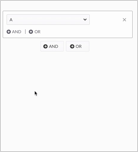
Variant 1

Variant 2
Iteration
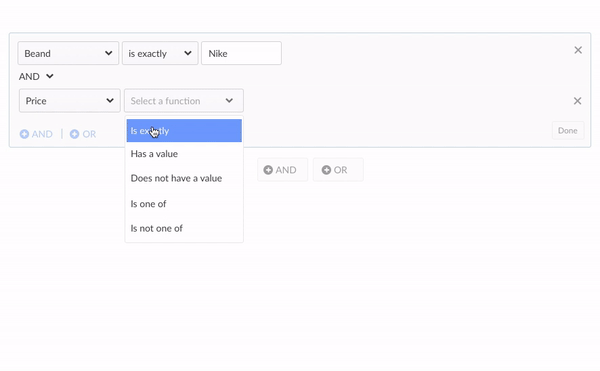
After I get some ideas about our direction, the next coming up question is what if the segment filter editor get super complex? Is it still easy to understand?
When adding more logics, it becomes really hard to read. Besides, the horizontal line that separate the the logic is really hard to see

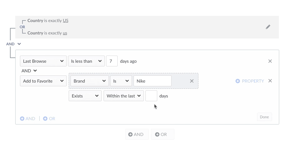
Preview of complex criteria in a segment
To fixed this, I work with project manager did several rounds of testing and iterations. The final solution was that we added a done button inside of the block. So, when the users completed a set of filters and hit done, then we collapsed it as plain english and used lines to draw the relationship between each criteria.
Interaction
The following images illustrate some of the micro interactions of the design that we found most impactful for the user.
Collapse the group while editing other group

Validate required column